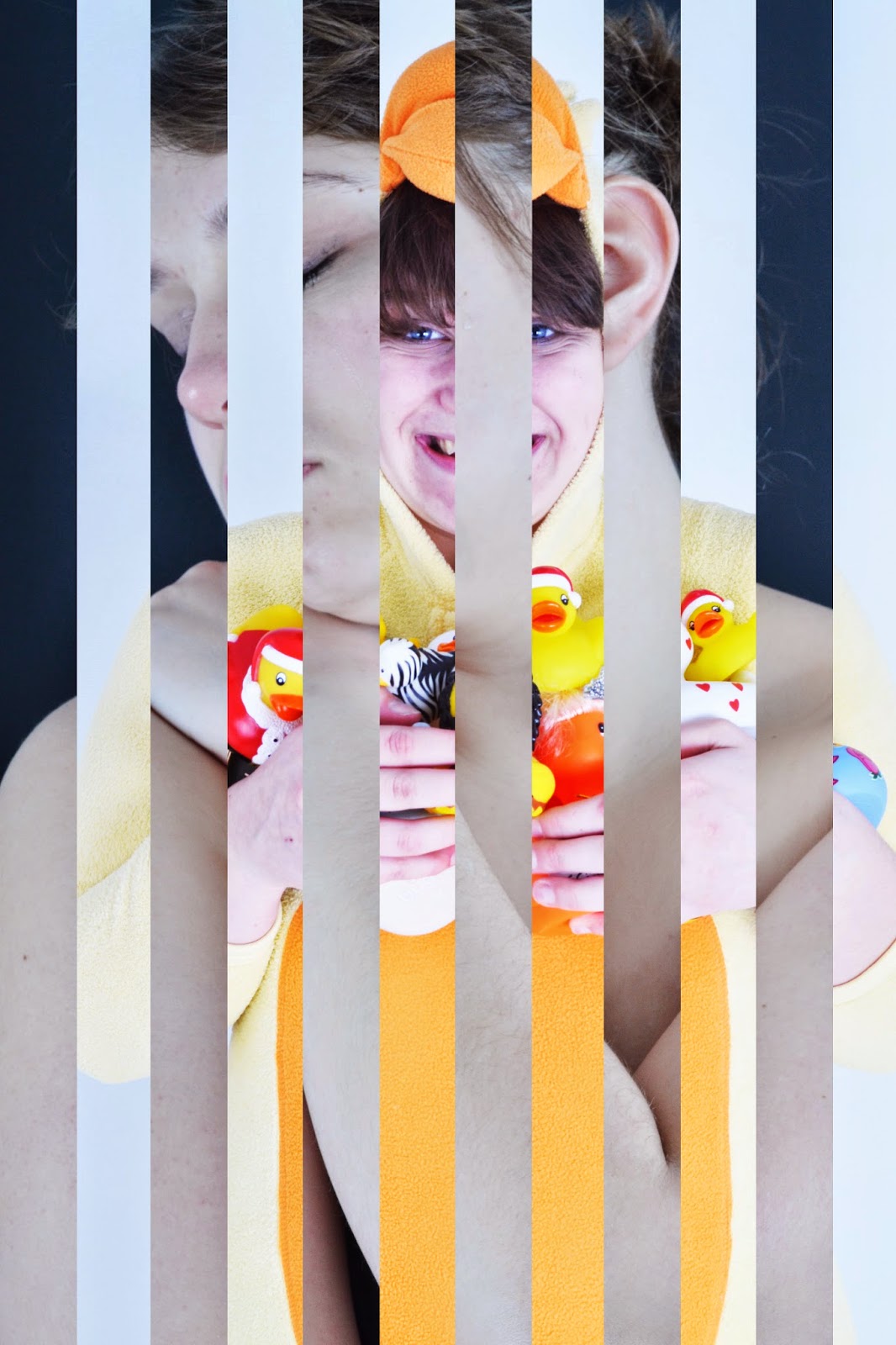
One of the ideas I had for the presentation for my final piece was a layered image that shows both sides of my model in her 'normal' persona and her 'weird' persona. I like the idea of someone who is viewing my photo to question what it is and as they continue to view the image they discover that it is two pictures of the same person. I want the images to look interesting visually and I want there to be depth created within my work.
The idea to create an image like this came from John Stezaker's work as he cuts and places different images together. However, where as he uses images of two different people, I want to use the images of the same person. To create these images I superimposed two different images of the same person together on Photoshop. I then created rectangles of the same size over the top of the image and deleted every other rectangle. This then revealed the image underneath in a layered manner. I decided to use a black and white background for all of images as it creates more of contrast within the final image, making the different persona's clearer.


After trying out the vertical stripes effect which I thought looked interesting, something else I wanted to try out was horizontal stripes. To create this image, I went through the same process as I did with the first set of photo's only I created the rectangles horizontally instead of vertically. Overall I think the first set of photos look better than this image visually.

Something else I wanted to try out was using boxes instead of stripes. Even though the stripes look good I also thought boxes could look interesting too. To create this image I superimposed two images together and the created different sized boxes on the images. I then deleted parts of the top image in the shape of the boxes to reveal the image underneath. Instead of having all of my images as stripes, I think it could look interesting to have a few of the images as boxes to mix up the overall look of my final images.

Something else I wanted to try was a using a background within my two images. Therefore I shot a background scene for one of my Tudor images and I then superimposed the Tudor image onto the background. I wanted to experiment with backgrounds and see if it would make a final image look more interesting than just using images from the studio. Even though I believe the background looks good with the Tudor image, I don't think it looks good with another basic image of my model superimposed over the top as it doesn't create as much contrast in the image as the black and white backgrounds do. It also makes the image look too confusing as there are essentially three different layers to the image with a background.


No comments:
Post a Comment